Styling the Mobile Layout in Fluid Engine
We created this page specifically to help you quickly solve issues you may be experiencing with the mobile layout of your website in Squarespace 7.1 using Fluid Engine.


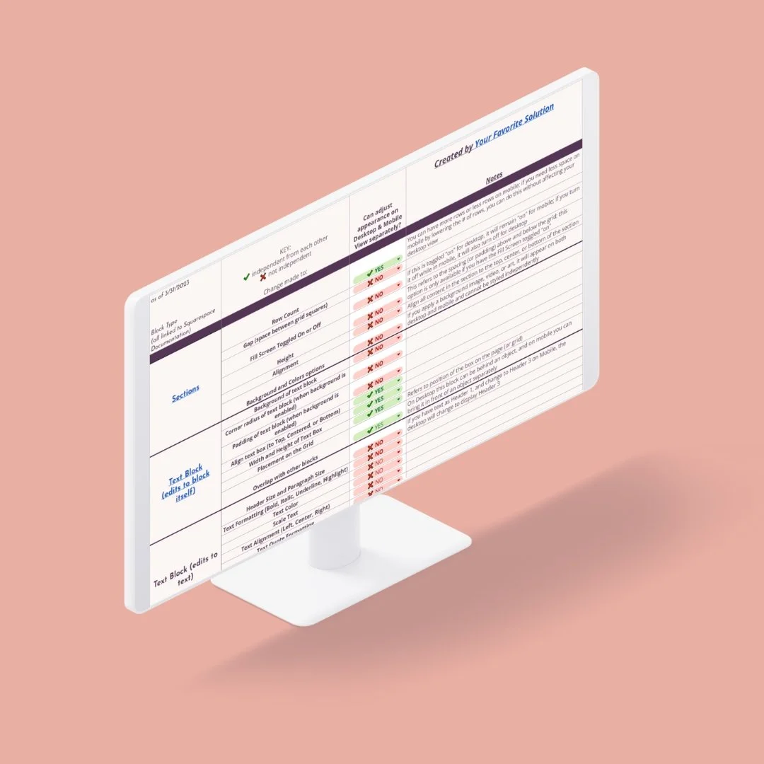
Reference Table for Mobile Layout Styling
○ 🔾 • ⏺ ○
○ 🔾 • ⏺ ○
We created an in-depth reference table detailing what styling elements can be edited on Mobile Layout without affecting its appearance on the desktop view.
Select a block and click the up or down arrow.
The menu arrow buttons will jump a block over the adjacent block. This is handy for moving a block over a larger area — such as from the bottom all the way to the top.
Click and hold your mouse to drag a block up or down.
Perfect for moving a block (or multiple blocks) at the same time.
Tip: You can hold down your shift key and select multiple blocks to move together. You can also click and drag your mouse to select several blocks together, but we have found that it is not always easy to do this on the Mobile view due to the smaller work area.
Use your keyboard’s arrow keys to nudge your elements up or down one row at a time.
Great for making final adjustments to spacing.
Watch for the blue dot in the upper right-hand corner
When you make edits to a section that affects the Mobile Layout (adding new blocks, etc.) a small blue dot will appear on the mobile icon in the top right.
Save often!
Save every chance you get. It’s easy to get in a groove and go long stretches of time editing a page (we find it to be tremendous fun), but hiccups happen!
Style sections in mobile layout as you go
As you finalize sections on a page, reordering items in mobile one section at a time is best. This will help keep the overwhelm down! But we suggest not spending too much time getting things “just right” until you’ve finalized and proofed all content.
Finalize your website copy and mockup first
Building your website will be so much faster if you finalize all content and graphics, then build a visual mockup. Having this visual will ensure your website flows properly while keeping your website goals in mind.
Blog Posts in Mobile Layout are unaffected by Fluid Engine
Blog post content is set up much like the Classic Editor, where you have the 12-column layout and insert blocks with the blue plus sign. Fluid Engine is not available for blog posts; therefore, there is no functionality for overlapping blocks like on a Fluid Engine Page.
This means that the Fluid Engine table (linked above) won’t apply to blog posts, and the Mobile Layout will default to stacking text and images on top of each in the order that they appear from left to right.
Mobile Layout Tips for Squarespace Fluid Engine
Need more help?
○ 🔾 • ⏺ ○
○ 🔾 • ⏺ ○
We offer services to help you with the Mobile Layout of your website.
Service tiers range from getting help on a couple of sections all the way up to your entire site.
Starting at $60